Shapes Make the World
Las Formas hacen el Mundo
For my final semesters at California State University of Los Angeles, I focused on a passion project. Throughout eight months I have been working on an interactive bilingual children’s book. Along with additional components, such as, a poster, stickers, and more interactive activities.

Character Design
My beginning sketches for my characters. The story is to be focused around shapes forming everyday objects. The idea was to make these characters lively and playful.

Writing the Story
When writing, the idea was to have the story consist of shapes, colors, and collaboration. Shapes Make the World is about numerous of shapes working together to create everyday objects. Their teamwork allows them to create a unique world they can call home.

Storyboarding
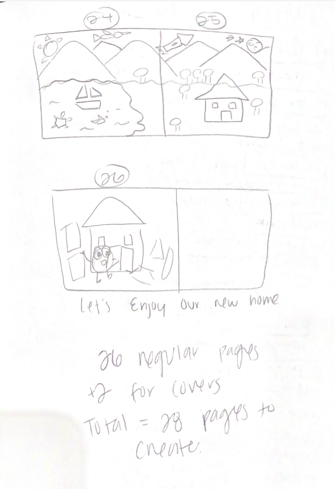
During this process the story set up was now being seen and developed for the first time. Drawing each page out determined the exact amount of pages needed to be illustrated.

Illustrating
With the written story and storyboard developed the illustration process could now begin. Through the magic of Procreate, exploration with different brushes helped to achieve the finished look. The goal was to create the shapes with a crayon texture with imperfections. Children’s drawings are never perfectly symmetrical, therefore a similar replicated style will encourage young readers to express further creativity when recreating these shapes.

Typography
-
Personality
Adjusting the text to the shape allowed the characters to be distinguished when speaking. This technique also allowed some excitement and personality to flow through.

-
Emphasis
Some words were bolded to express which object the shapes are referring to. Others were lighten and italicized to emphasize the color being discussed.

-
Creativity
Some text matched the direction and enthusiasm as the object being shown. Playing with the text expresses creativity that the child could experience as well.


Interactive
Since this book is a bilingual children’s book, a solution had to be made for both languages to fit onto one page. With the flip-up interaction this allows the child to read in English then read the Spanish translation underneath.

Book binding
The book binding was achieved with five layers of Mod Podge that held the pages together. Binder clips helped the pages stay in formation while the glue dried. And the fabric was used so the binder clips did not leave an indent on the paper.

Book Cover
Now it’s time to judge a book by its cover. The goal was to have all the shapes onto the front cover, and a few items they made on the back cover. This gives foreshadowing to what the story is about.

Made two books to see if the cover was better with lamination or without.
Two Attempts

Additional Components

The Poster
After the book was physically assembled, it was time to design a promotional book poster. The goal for the poster was to give a brief description about the book with the characters and the objects they created.

Stickers
Requests for stickers were in high demand when creating this project. The characters are the main appeal when reading the story. Therefore, they had to be implemented on the sticker while also showing their playfulness.

Exhibit Plan
For this final senior project, it will be displayed in the university’s gallery. The Exhibit Plan needed to have embellished instructions to set up the ideal display.

The Gallery
Work on full displayed. So happy that people took stickers and business cards. Saw people interacting with the felt on the whiteboard, and reading the book. Everything was perfectly executed as anticipated.


