Real World Inspired ABC’s


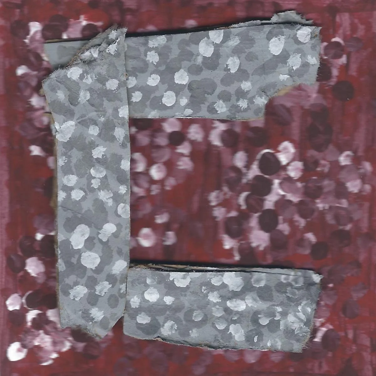
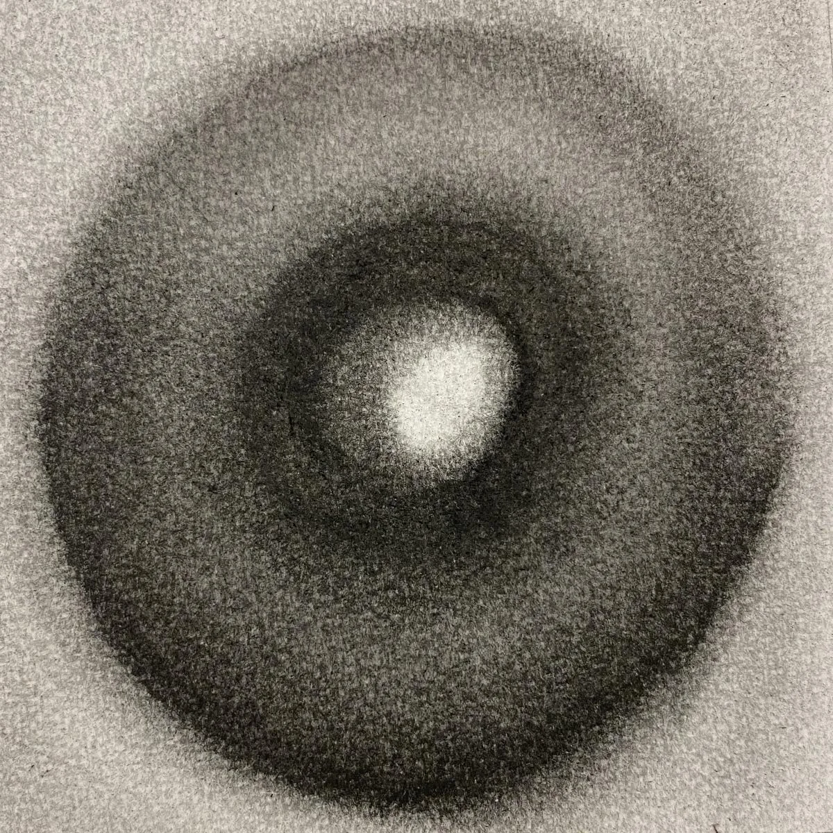
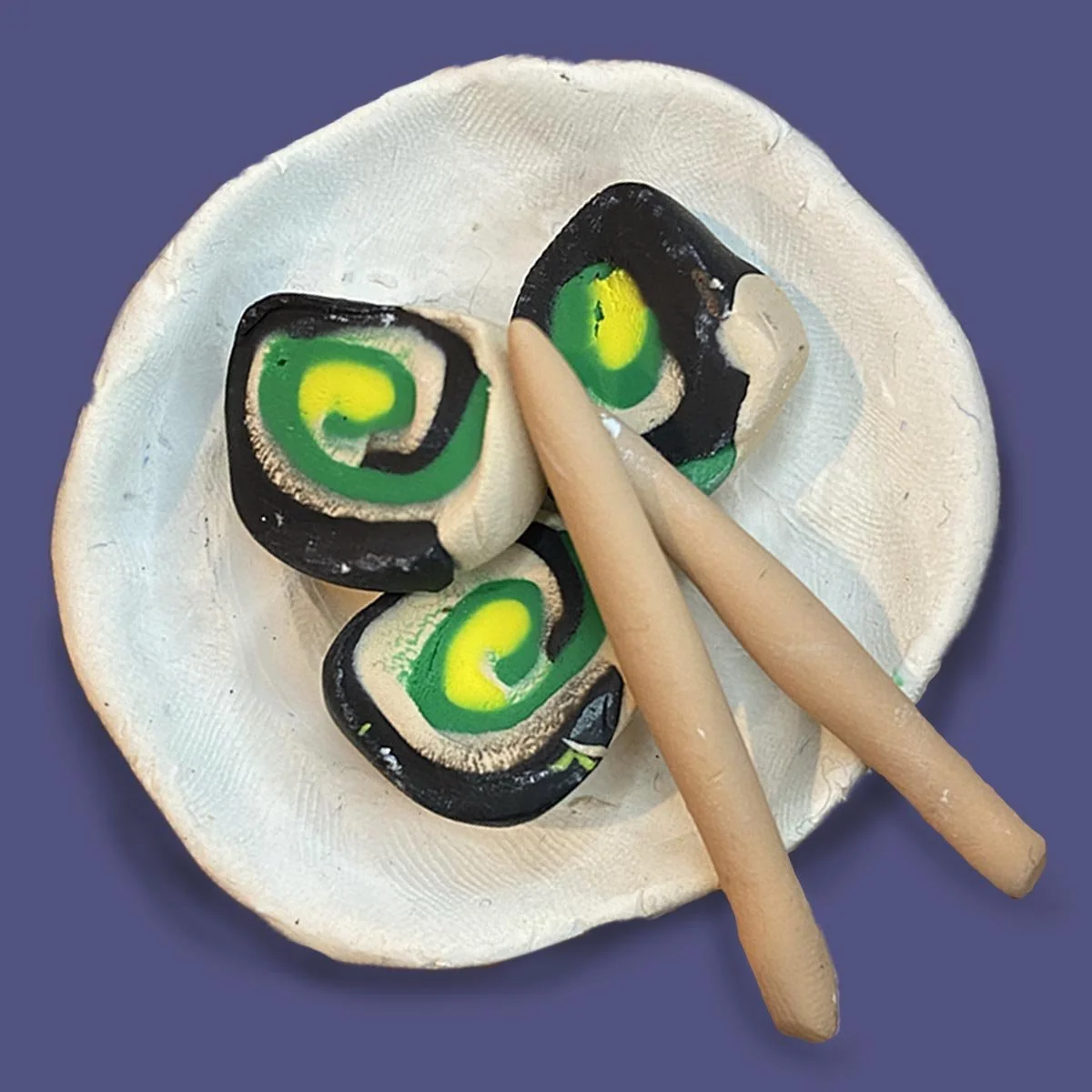
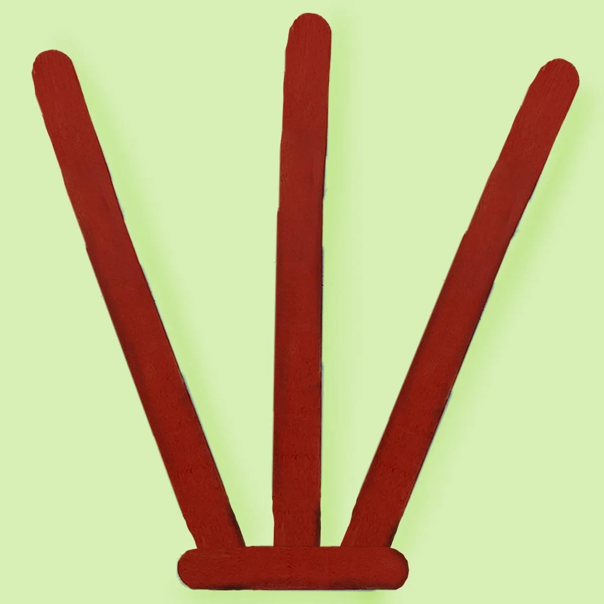
My Typography 1 class, I found objects that looked like letters. Using the found items as inspiration to create my alphabet along with exploring different materials for the composition to have variety of textures and colors. Each letter is set on a 4x4 PDF from either Illustrator or Photoshop. The final assignment is to have all the letters come together on a 24x24 poster to show the unique typography of the ABC’s.

The ABC’s poster *
The ABC’s poster *

The final poster is 24x24. Once assembling the letters together some adjustments had to be made. For instance, some squares that were neighbors had similar background colors, therefore one had to be changed so the poster wouldn’t be unbalanced. To keep the poster a perfect square the “I & J” had to share a space. In conclusion, the poster has inviting colors and various textures that made my letters playful. A few months after my poster was finished it was displayed at the Ronald H. Silverman art gallery at Cal State Los Angeles University.

-
![]()
“A”
Black India ink
-
![]()
“B”
Polymer clay
-
![]()
“C”
Cardboard and Alyric paint
-
![]()
“D”
Charcoal
-
![]()
“E”
Photoshop
-
![]()
“F”
Alyric paint
-
![]()
“G”
Photoshop
-
![]()
“H”
Popsicle sticks
-
![]()
“I & J”
Alyric paint & ribbons
-
![]()
“K”
Posca markers
-
![]()
“L”
Posca markers
-
![]()
“M”
Charcoal
-
![]()
“N”
Procreate
-
![]()
“O”
Charcoal
-
![]()
“P”
Aluminum foil
-
![]()
“Q”
Polymer clay
-
![]()
“R”
Posca markers
-
![]()
“S”
Polymer clay
-
![]()
“T”
Photoshop
-
![]()
“U”
Fabric paint & old jeans
-
![]()
“V”
Procreate
-
![]()
“W”
Popsicle sticks
-
![]()
“X”
Black India ink
-
![]()
“Y”
Procreate
-
![]()
“Z”
Photoshop

-
![]()
“A”
Fan
-
![]()
“B”
Bug trap & treat jar
-
![]()
“C”
Bricks
-
![]()
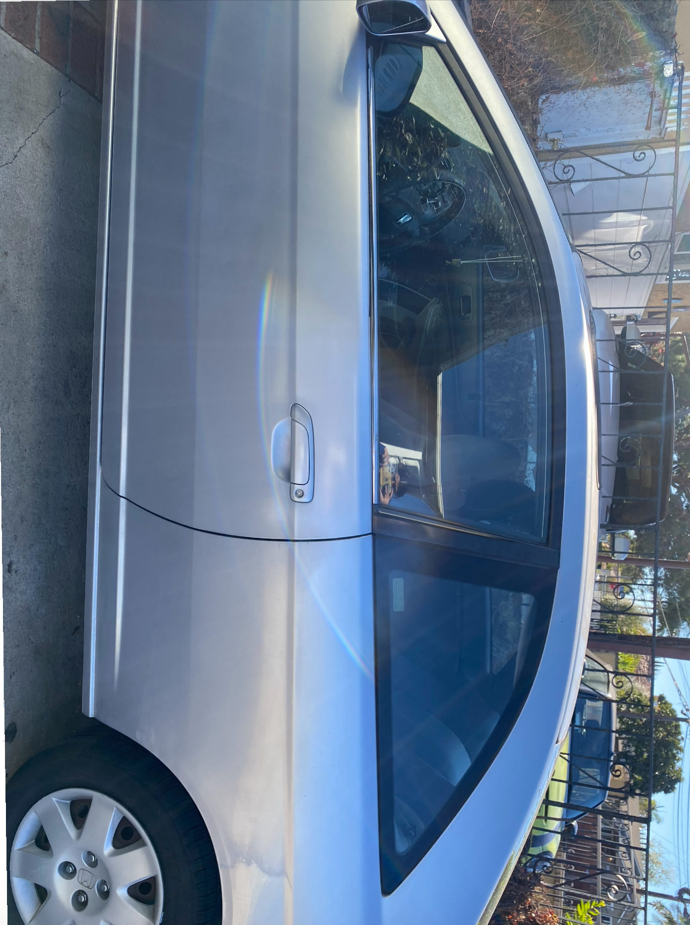
“D”
Car window
-
![]()
“E”
My dog, his name is Loki
-
![]()
“F”
Traffic light
-
![]()
“G”
Tape dispenser
-
![]()
“H”
Tree pot
-
![]()
“I &J”
Traffic cone & hand rail
-
![]()
“K”
Staircase
-
![]()
“L”
Electric scooter
-
![]()
“M”
Bike rack
-
![]()
“N”
High heels
-
![]()
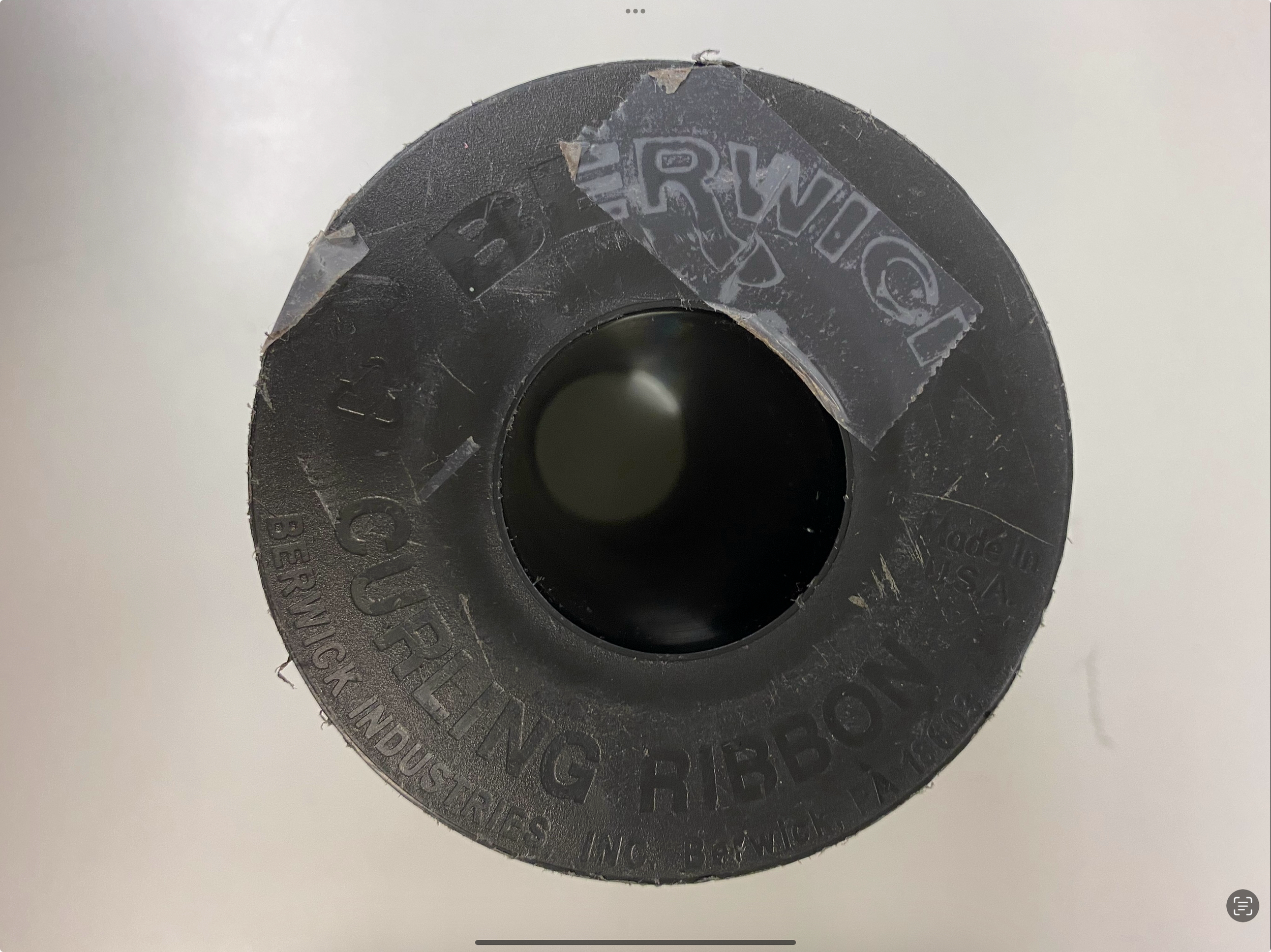
“O”
Ribbon spindle
-
![]()
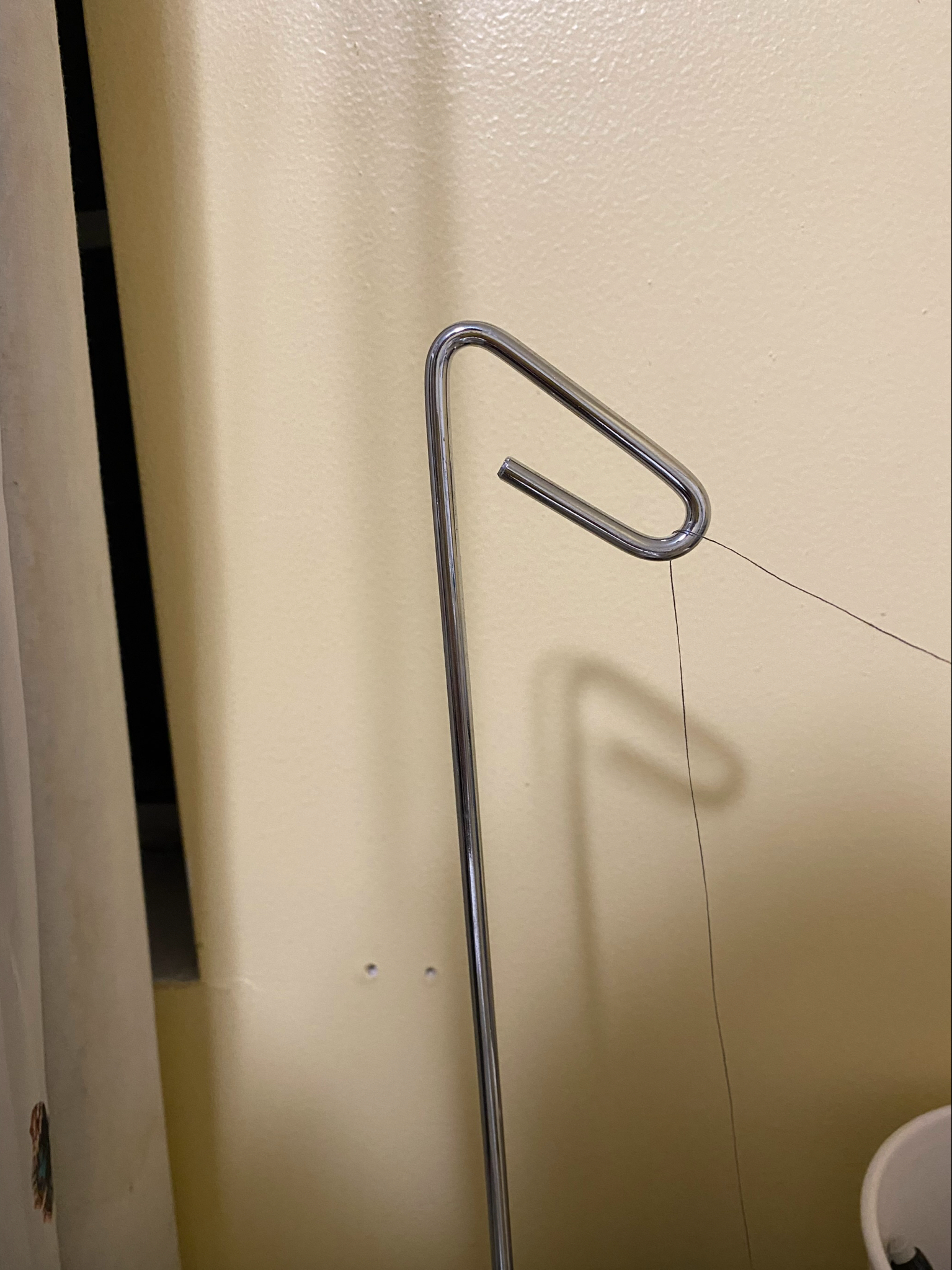
“P”
Sewing spindle
-
![]()
“Q”
Sushi plate
-
![]()
“R”
Phone charger
-
![]()
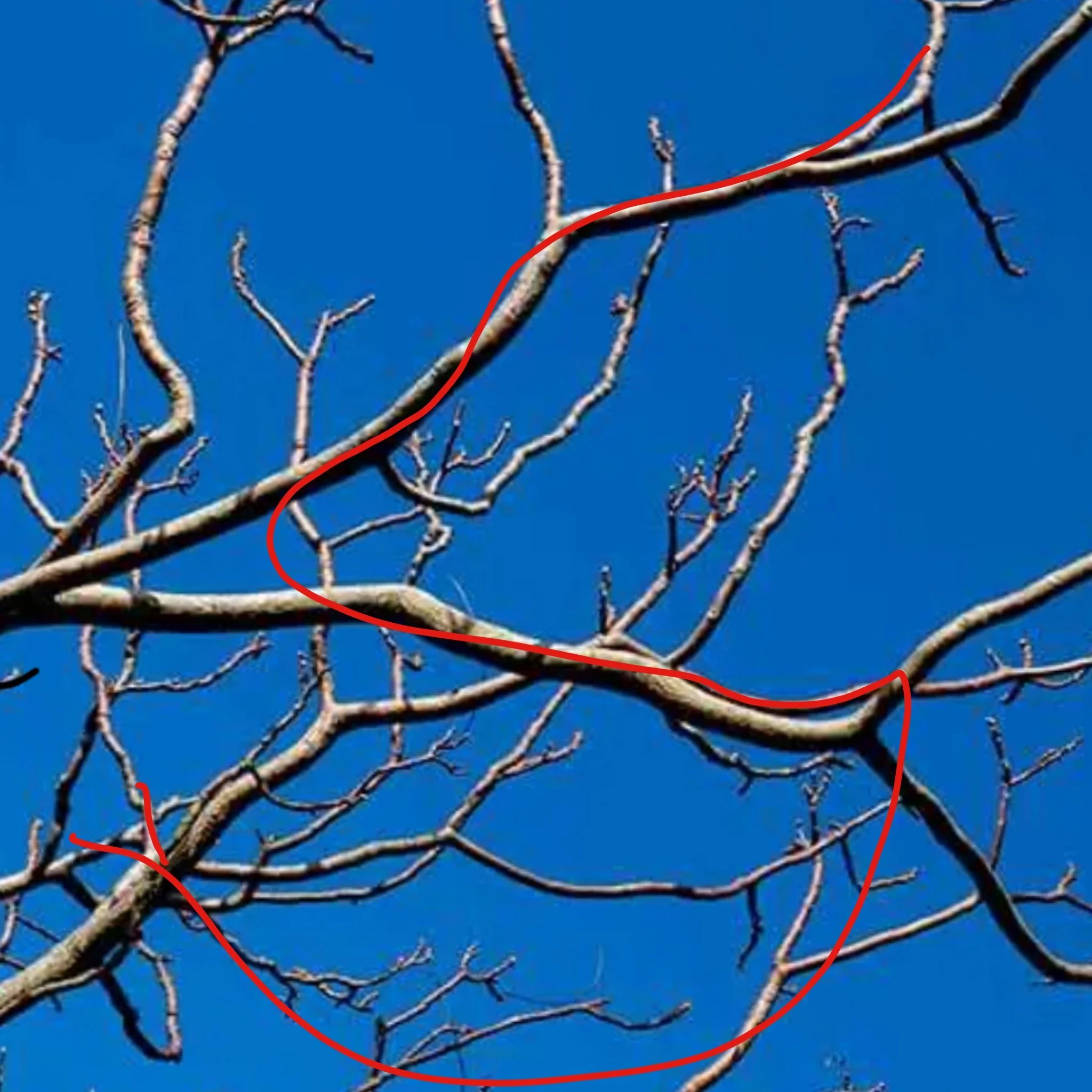
“S”
Tree branches
-
![]()
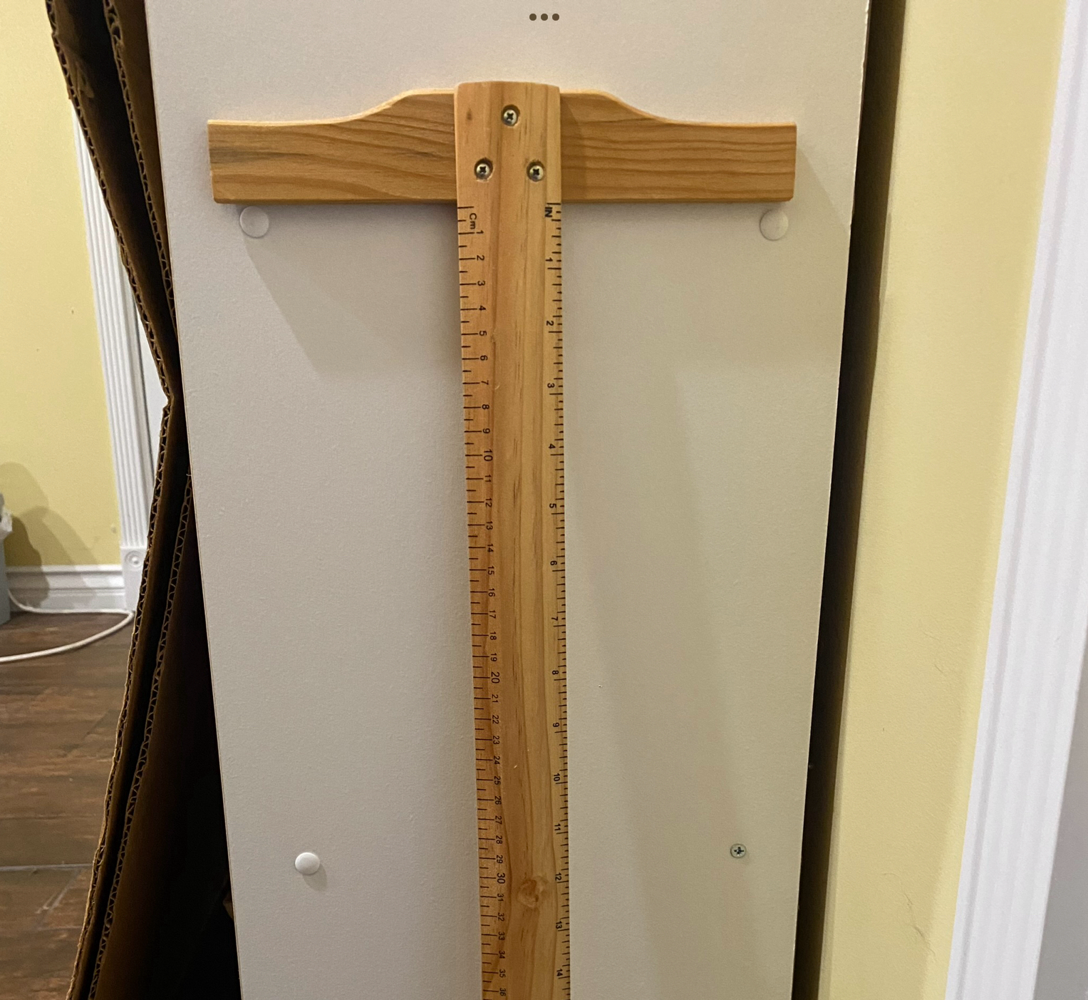
“T”
Right angle ruler
-
![]()
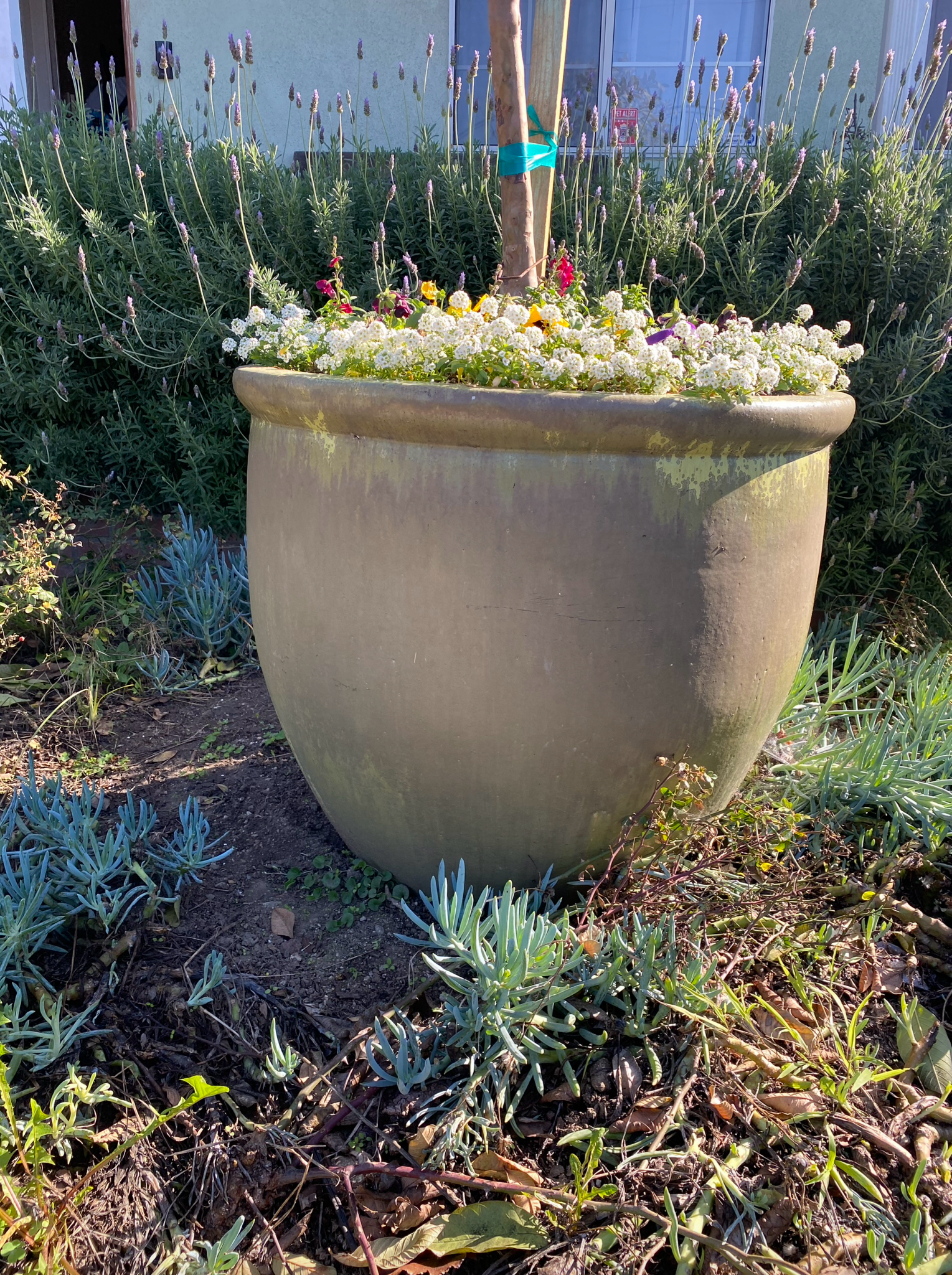
“U”
Giant pot
-
![]()
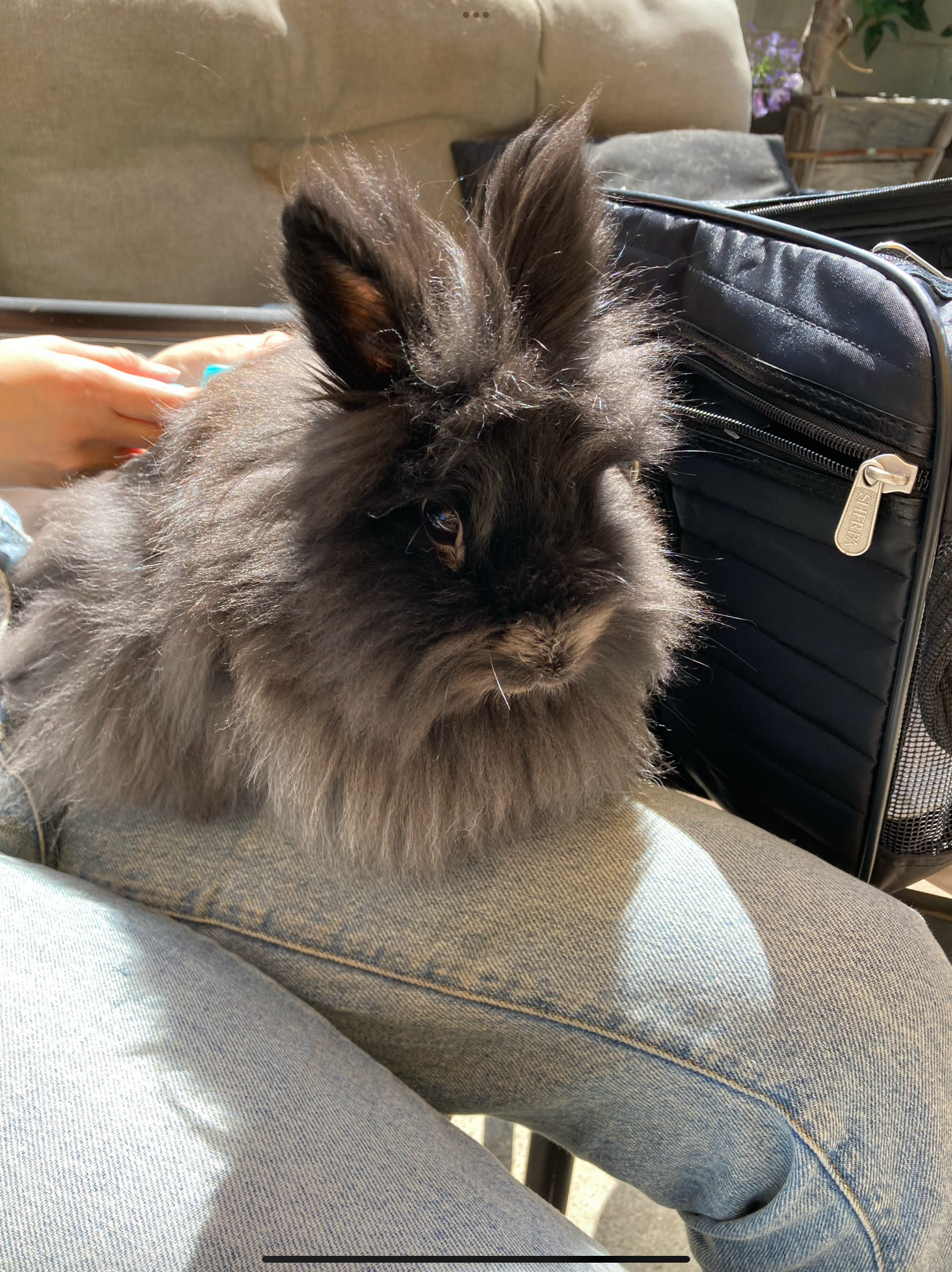
“V”
My rabbit, his name is Mercury
-
![]()
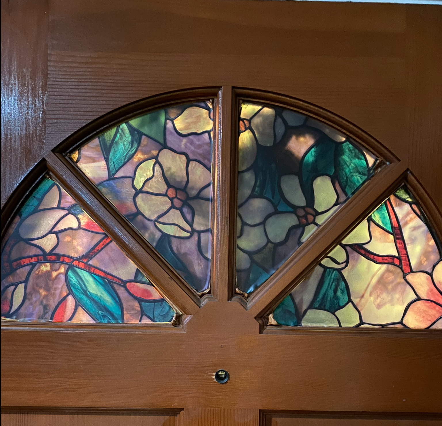
“W”
Front door window
-
![]()
“X”
Folding table
-
![]()
“Y”
Chicken
-
![]()
“Z”
Staircase handrail, unfortunately lost the original photo

At the Ronald H. Silverman Art Gallery


