Pulp Fiction Comics
For a college project we had to select a local business and upscale it using Graphic Design. The selected business was a local comic book shop called Pulp Fiction comics. Various of digital and printable campaigns were designed to display the new brand of Pulp Fiction.

The Logo

Before

After

The vector tool was used to create the new Pulp Fiction typeface. The exclamation is purposefully blue to signify the location of the comic book store. The store is located in Culver City, and blue is the city’s signature color.

Print Advertisement #1

Considering different ways to advertise Pulp Fiction, magazine advertising seemed the most plausible. This ad concept was focused on the comic book discounts that were mentioned on the Pulp Fiction website. The business stated that they carry boxes filled with old and used comic books. They sell them starting at 25 cents unlike any comic book store. Their common phrase is “Deep Discounts”, so my idea was to have classic comic book hero’s looking into one of those boxes, and use a play on word with “Saving”.


Print Advertisement #2

This concept was to be based off a comic book grid. The comic book store does signings every first Saturday of the Month, so I used Photoshop to place Spider-man coming out of the page to sign the comic book. Pulp Fiction means the type of page quality that is used for comic books. Adding texture to the grid was to give the idea of how Pulp Fiction comic books would feel.


Additional Components

Because of rebranding there are other components to consider. I needed to think of other items that can be rebranded with the new style of Pulp Fiction. The original boxes used for the deep discounts were worn out. The solution was to embellish the old boxes by placing the exclamation point all over. I also created stickers for the pricing of the comic books. They were shaped to look like an exclaimed speech bubble.

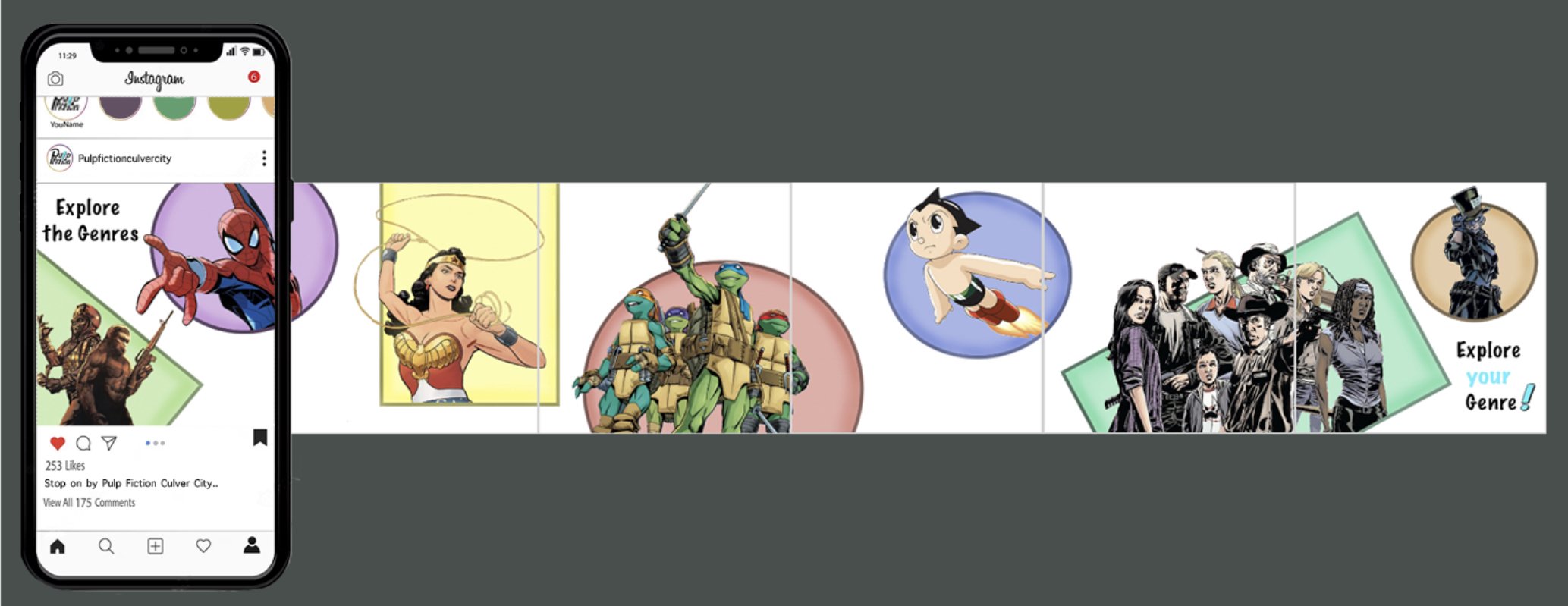
Instagram Carousel
Pulp Fiction does have an instagram account, so I also considered how to promote the business through social media.


